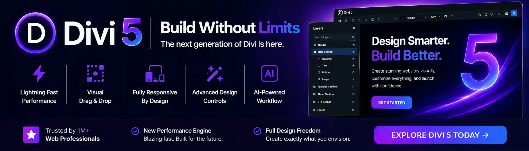
In today’s digital age, having a website that looks great on all devices is crucial for attracting and retaining users. That’s where Divi Responsiveness comes in. With its innovative design features and intuitive interface, Divi ensures that your website maintains its seamless design across devices. Gone are the days of frustrating scrolling and distorted images. With Divi, you can rest easy knowing that your website will adapt effortlessly to any screen size, from desktops to smartphones. Say goodbye to clunky user experiences and hello to a website that not only looks stunning but also provides a seamless browsing experience for your visitors.

Understanding Divi Responsiveness
What is Divi?
Divi is a popular WordPress theme developed by Elegant Themes. It is known for its drag-and-drop functionality and user-friendly interface, allowing anyone to create stunning websites without needing coding skills. Divi offers numerous features and customization options, including its powerful responsiveness capabilities.
What is responsiveness in web design?
Responsiveness in web design refers to the ability of a website to adapt and scale seamlessly across different devices and screen sizes. With the increasing use of smartphones, tablets, and various other devices to access the internet, it has become crucial for websites to provide an optimal user experience on all platforms. Responsive design ensures that a website layout, content, and functionality adjust according to the device being used, offering a consistent and pleasant user experience.
Why is Divi responsiveness important?
Divi responsiveness plays a vital role in ensuring that websites built with the theme look and function flawlessly across all devices. With a significant percentage of website visitors accessing sites from mobile devices, neglecting responsiveness can result in a poor user experience, increased bounce rates, and decreased engagement. Divi’s responsiveness features allow users to create websites that not only look visually appealing but also provide a seamless experience to visitors, regardless of the device they use.
Benefits of utilizing Divi’s responsiveness features
- Improved user experience: Divi’s responsiveness features enable easy optimization of website layouts for different devices, ensuring a smooth and intuitive user experience for all visitors.
- Time and cost savings: Divi’s built-in responsiveness eliminates the need for complex coding or hiring a developer to create separate versions of the website for different devices. This saves time and reduces expenses.
- Consistency across devices: Divi’s responsiveness features help maintain consistent brand identity and design aesthetics across various devices, reinforcing brand recognition and trust.
- Increased mobile traffic engagement: With mobile internet usage surpassing desktop, responsive websites built with Divi can attract and engage the growing mobile audience effectively.
- Future-proof designs: With Divi’s responsiveness, websites can adapt to new devices and screen sizes that may emerge in the future, ensuring longevity and relevance.
Key Elements of Divi Responsiveness
Grid System
Divi’s grid system is a fundamental component of its responsiveness. It allows users to easily create and customize website layouts by dividing the page into rows and columns. The grid system ensures that the website elements automatically adjust and reposition themselves based on the screen size, maintaining a visually appealing and organized layout across devices.
Responsive Design Modes
Divi offers three responsive design modes: Desktop, Tablet, and Smartphone. These modes allow users to fine-tune the appearance and behavior of elements specific to each device. By switching between the modes, users can easily tailor their website’s responsiveness to offer an optimal experience on different screen sizes.
Viewport Options
Divi provides viewport options that enable users to control how their website appears on different devices. Users can adjust settings such as width, height, and scaling, allowing them to precisely control the responsiveness of their website and how it fills the screen on different devices. These options ensure that the website looks visually appealing and functions correctly on various screen sizes.
Breakpoints
Breakpoints are predefined screen widths at which the website design adapts to match the specific device’s capabilities. Divi allows users to customize breakpoints and specify different design settings for each. By adjusting breakpoints, users can ensure that their website’s layout and content reflows and scales appropriately, creating a smooth and optimized experience on all devices.


Customizing Divi Responsiveness
Using Divi’s Visual Builder for responsive design
Divi’s Visual Builder is a powerful tool that simplifies the process of customizing responsiveness. With the Visual Builder, users can visually design their website and make real-time changes to the layout, content, and responsiveness. It offers an intuitive interface where users can modify elements, adjust settings, and preview the changes instantly, making it convenient to create a responsive website without any coding knowledge.
Adjusting column and row settings
Divi allows users to customize individual column and row settings for different devices. This level of control enables users to fine-tune the appearance and behavior of elements within each section of their website. Users can adjust column and row heights, widths, and spacing for specific devices, ensuring a visually pleasing and optimized layout across various screen sizes.
Custom media queries
For advanced users or those with specific customization requirements, Divi allows the integration of custom media queries. Media queries are CSS techniques that target specific screen sizes or device features to apply custom styling rules. By utilizing custom media queries within Divi, users can further refine the responsiveness of their website and ensure that it adapts exactly as intended across different devices.
Utilizing Divi’s modules for different device sizes
Divi offers a wide range of modules, which are pre-designed elements that users can add to their website. These modules, such as sliders, galleries, and pricing tables, are automatically made responsive by Divi. Users can configure how each module appears on different devices, maintaining consistency while adjusting the display to suit the unique needs and limitations of each device type.
Best Practices for Divi Responsiveness
Optimizing images for different devices
To ensure optimal performance and user experience, it is crucial to optimize images for different devices. Divi provides settings to control image sizes, quality, and compression levels, allowing users to strike a balance between visual appeal and page loading speed. By properly optimizing images, users can reduce load times and improve the overall performance of their responsive website.
Testing and previewing responsiveness
Before publishing a website built with Divi, it’s important to thoroughly test its responsiveness across multiple devices and screen sizes. Divi offers a responsive preview mode that allows users to view and interact with their website as it would appear on different devices. Testing and previewing responsiveness helps identify and resolve any layout or functionality issues, ensuring a smooth and consistent experience for all users.
Considering user experience across devices
Divi responsiveness is not just about making a website look visually appealing on different devices, but also about providing an exceptional user experience. It’s important to consider factors such as touch-friendly navigation, legibility of text, and intuitive interaction elements. By keeping the user experience at the forefront, users can create responsive websites that engage and delight visitors, regardless of the device they use.
Ensuring text readability and legibility
Text plays a critical role in conveying information on a website. When designing responsive websites with Divi, it’s essential to ensure that the text remains readable and legible across different screen sizes. Divi offers typography settings that allow users to adjust font sizes, line heights, and spacing specifically for each device. Careful consideration should be given to typography choices to ensure optimal readability and enhance user experience.

Common Challenges and Solutions
Issues with responsive layouts
One common challenge in responsive design is maintaining the layout’s visual appeal and functionality across devices. Divi’s grid system and responsive design modes help address this challenge by automatically adjusting the layout’s structure and elements based on the device being used. Users can further fine-tune the layout using column and row settings, ensuring a consistent and visually appealing layout across all screen sizes.
Overcoming image distortion
Images can sometimes become distorted or lose quality when scaling for different devices. Divi’s image optimization features help mitigate this challenge by allowing users to specify proper image sizes, compression levels, and quality settings. By optimizing images appropriately for different devices, users can ensure that images appear crisp and clear, enhancing the overall visual experience of their responsive website.
Handling content hierarchy on smaller screens
On smaller screens, it can be challenging to maintain a clear content hierarchy and ensure that the most important information is easily accessible. Divi’s responsive design modes and adjustable breakpoints enable users to customize the appearance and behavior of website elements for smaller screens. By prioritizing essential content, minimizing clutter, and optimizing the layout for smaller devices, users can effectively address content hierarchy challenges.
Dealing with complex designs
Complex designs can pose challenges when it comes to responsiveness. Divi’s custom media queries and extensive customization options allow advanced users to fine-tune even the most intricate designs for different devices. By leveraging Divi’s powerful responsiveness features and spending time refining the design for each device, users can achieve a responsive website that showcases complex designs without compromising functionality or user experience.
Resources for Divi Responsiveness
Divi documentation and tutorials
Elegant Themes, the developers of Divi, provide comprehensive documentation and tutorials to help users understand and utilize the theme’s responsiveness features effectively. Their official website offers a wealth of resources, including step-by-step guides, video tutorials, and an active community forum.
Divi community and support
The Divi community is a thriving online community of designers and developers who use the theme. Within this community, users can find valuable insights, tips, and tricks related to Divi responsiveness. The support provided by Elegant Themes allows users to seek assistance for any specific challenges they may face while implementing Divi responsiveness.
Third-party plugins and integrations
Divi supports numerous third-party plugins and integrations that enhance its responsiveness capabilities. These plugins and integrations offer additional functionality, customization options, and specialized features to further optimize the responsiveness of Divi websites. Users can explore these options to extend the capabilities of Divi and achieve even more sophisticated responsive designs.
Web design resources for responsive design
In addition to Divi-specific resources, general web design resources focusing on responsive design can provide valuable insights and inspiration. Online platforms, blogs, and forums dedicated to web design offer a wealth of information on best practices, emerging trends, and case studies related to responsive design. By staying updated with the latest industry knowledge, users can continue to hone their skills and create outstanding responsive websites with Divi.

Case Studies on Divi Responsiveness
Examples of successful Divi responsive designs
Numerous websites showcase the successful implementation of Divi’s responsiveness features. These examples illustrate how different businesses, organizations, and individuals have utilized Divi to create visually stunning and fully responsive websites. Studying these examples can provide inspiration and practical insights for implementing Divi’s responsiveness features effectively.
Case studies showcasing improved mobile experience
Mobile experience is a crucial aspect of responsiveness, and there are many case studies highlighting the impact of Divi on improving mobile user experience. These studies delve into the challenges faced by businesses with non-responsive websites and the subsequent positive results after adopting Divi’s responsiveness features. These case studies demonstrate how Divi can transform a website’s mobile experience and drive meaningful results.
Impact of Divi responsiveness on user engagement
Divi responsiveness has a significant impact on user engagement. Case studies and user testimonials highlight the positive influence of Divi’s responsiveness features on user behavior metrics, such as longer session durations, reduced bounce rates, and increased conversions. These insights emphasize the importance of prioritizing and optimizing responsiveness to engage and retain website visitors effectively.
Client testimonials on Divi’s responsive capabilities
Client testimonials provide valuable firsthand experiences of businesses or individuals who have used Divi to create responsive websites. These testimonials showcase the ease of use, flexibility, and positive outcomes achieved by leveraging Divi’s responsiveness features. Such testimonials provide real-world evidence of Divi’s effectiveness in building responsive websites and can help potential users make informed decisions regarding its adoption.
Future Trends in Divi Responsiveness
Advancements in responsive design techniques
The field of responsive design is continuously evolving, and Divi aims to stay at the forefront of these advancements. We can expect Divi to incorporate new features and techniques that enhance its responsiveness capabilities, making it even more intuitive and versatile for users to create exceptional responsive websites.
Integration of artificial intelligence for adaptive layouts
Artificial intelligence is playing an increasingly significant role in web design. Divi may explore incorporating AI-powered algorithms to automatically adapt layouts and content based on user preferences, behavior patterns, and device capabilities. This adaptive approach can further optimize Divi’s responsiveness and offer personalized experiences that dynamically respond to individual users.
Responsive design and SEO considerations
As search engines evolve, they prioritize and reward mobile-friendly websites in search rankings. Divi will likely continue to enhance its responsiveness features to align with SEO best practices and ensure that websites built with the theme receive the SEO benefits. This will include optimizing page loading speed, mobile-friendliness, and other factors that search engines consider important for ranking purposes.
Mobile-first approach in web design
Given the dominance of mobile devices in website traffic, a mobile-first approach has become increasingly popular. Divi may continue to refine its responsiveness features to support this approach, focusing on mobile design and ensuring seamless experiences for mobile users. By embracing a mobile-first mindset, Divi can empower users to create websites that prioritize mobile users while maintaining a cohesive experience across all devices.

Conclusion
In today’s multi-device world, Divi’s responsiveness features are essential for creating seamless and captivating website experiences. Divi’s comprehensive responsiveness capabilities, including the grid system, responsive design modes, viewport options, and breakpoints, provide users with the tools they need to create websites that adapt beautifully across devices.
By utilizing Divi’s Visual Builder, adjusting column and row settings, implementing custom media queries, and leveraging Divi’s modules, users can customize their website’s responsiveness to fit their unique design requirements. Adhering to best practices such as optimizing images, testing responsiveness, considering user experience, and ensuring text readability further enhances the quality of responsive websites built with Divi.
While challenges may arise, Divi offers solutions for issues with responsive layouts, image distortion, content hierarchy on smaller screens, and complex designs. The availability of resources including documentation, tutorials, community support, and third-party plugins empowers users to maximize Divi’s responsiveness features.
Through case studies, client testimonials, and a look into future trends, it is evident that Divi’s responsiveness capabilities have a profound impact on user engagement, mobile experience, and overall website performance. Divi continues to evolve, staying ahead of advancements in responsive design techniques and embracing trends like AI integration, SEO considerations, and a mobile-first approach.
In conclusion, by embracing Divi’s responsiveness features, users can create stunning and user-friendly websites that deliver seamless and captivating experiences to visitors across all devices. Divi’s commitment to responsiveness is a testament to the importance of delivering exceptional user experiences in today’s digital landscape. So, whether you are a business owner, designer, or developer, do not miss out on the incredible benefits Divi’s responsiveness offers. Start building beautiful and responsive websites with Divi today!