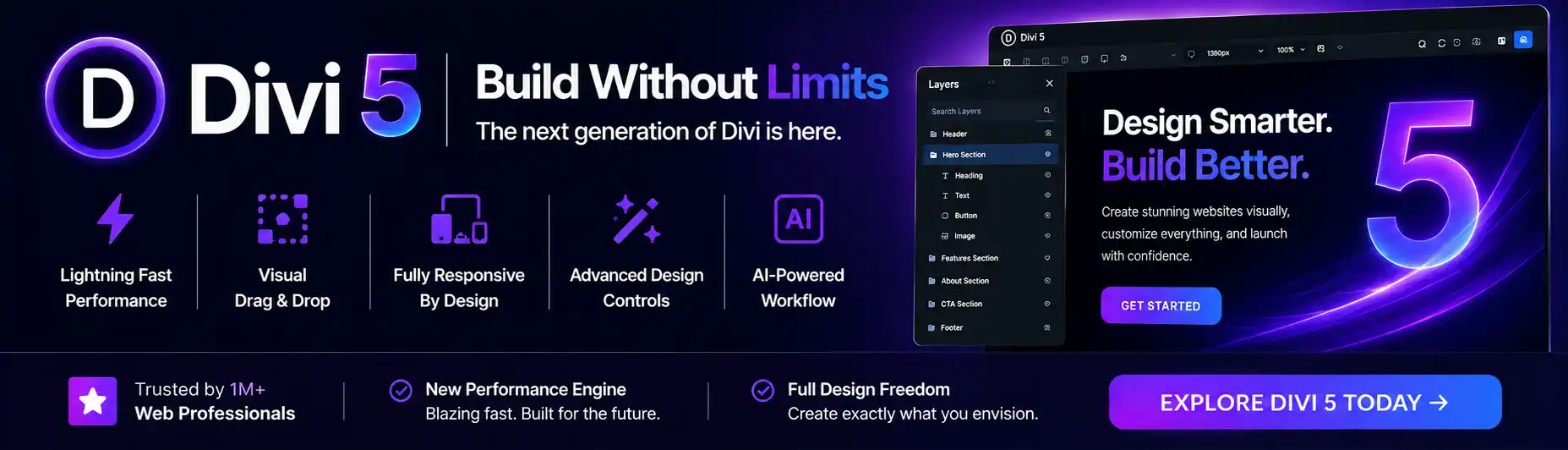
Are you tired of your website looking distorted on mobile devices? Look no further, because Divi has got you covered! In this article, we will explore how Divi, a powerful website builder, ensures that your site is responsive and looks great on any screen size. Say goodbye to frustrated users and hello to a seamless mobile experience. So, let’s dive in and discover how Divi can help you master mobile!

What is Responsive Web Design?
The importance of responsive web design
In today’s digital age, more and more people are accessing the internet on their mobile devices. As a website owner, it’s crucial to ensure that your site is accessible and user-friendly on all screen sizes. This is where responsive web design comes into play. Responsive web design is a design approach that aims to create websites that automatically adapt and respond to different screen sizes, ensuring a seamless browsing experience for users across devices.
What it means for a website to be responsive
A responsive website means that the layout and content adjust dynamically based on the device being used to view it. Whether someone is accessing your website on a smartphone, tablet, or desktop computer, a responsive design will resize and reposition elements to fit the screen perfectly. This ensures that users can easily navigate and interact with your site without having to constantly zoom in or out.
How a responsive design improves user experience
A responsive design is more than just aesthetics; it plays a crucial role in providing a positive user experience. When a website is not responsive, it can lead to frustrated users who struggle to read or interact with the content. With a responsive design, your site will automatically adapt to the user’s device, making it easier to read and navigate. Whether it’s enlarging font sizes, rearranging content, or adjusting menus, a responsive design makes it easier for users to consume your content and achieve their goals on your site.
Why Divi is the Best Choice for Responsive Web Design
Divi’s built-in responsive design features
Divi is a powerful WordPress theme that offers a range of built-in responsive design features. From the moment you start building your website with Divi, you can rest assured that your site will look great on any device. Divi takes care of the technical aspects of responsive design, allowing you to focus on creating beautiful and engaging content. With Divi, you don’t need to be a coding expert or hire a developer to ensure your site is responsive.
How Divi adapts to different screen sizes
One of the reasons why Divi is the best choice for responsive web design is its ability to adapt to different screen sizes seamlessly. Whether it’s a large desktop monitor, a tablet, or a smartphone, Divi’s intelligent design system automatically adjusts the layout and content to fit the screen perfectly. This means that your website will retain its professional look and feel on any device.
Benefits of using Divi for mobile optimization
Using Divi for mobile optimization offers numerous benefits. Firstly, it saves you time and effort by eliminating the need to manually code or customize your site for different devices. Divi’s responsive design features take care of this for you. Secondly, Divi allows you to create a consistent and cohesive user experience across devices, ensuring that your brand identity remains intact. Lastly, Divi’s mobile optimization features contribute to better search engine rankings, as Google prioritizes mobile-friendly sites in its search results.
Using Divi to Create a Mobile-Friendly Layout
Choosing a responsive layout in Divi
When designing a mobile-friendly layout with Divi, you have the option to choose from a variety of pre-designed responsive layouts. Divi provides a wide range of templates that are specifically optimized for mobile devices. These layouts are designed to ensure a smooth and user-friendly experience for mobile users. Simply browse through the available options and select the one that best suits your website’s needs.
Customizing the layout for mobile devices
Once you have chosen a responsive layout, Divi allows you to customize it to your liking for mobile devices. You can easily customize the font sizes, colors, and spacing to ensure optimal readability on smaller screens. Divi’s intuitive drag-and-drop editor makes it easy to rearrange and resize elements, ensuring that your content is displayed in the most effective way on mobile devices.
Testing and optimizing the mobile view
After customizing the layout for mobile devices, it’s important to thoroughly test and optimize the mobile view of your website. Divi provides a live preview feature that allows you to see how your site will look on different devices in real time. Take the time to navigate through your site on various mobile devices to ensure that all elements are displayed correctly and that the user experience is seamless. Identify any areas that may require further optimization and make the necessary adjustments.
Optimizing Content for Mobile Viewing
Making text easy to read on small screens
One of the key considerations when optimizing content for mobile viewing is ensuring that the text is easy to read on small screens. Divi makes this process straightforward by allowing you to adjust the font sizes to a legible level for mobile users. It’s important to strike a balance between readability and aesthetics, ensuring that the text is not too small or too large. Divi’s responsive design features ensure that the text is automatically resized to fit the screen on any device.
Choosing the right font sizes and colors
In addition to adjusting font sizes, it’s essential to choose the right font colors for mobile viewing. Ensure that there is enough contrast between the text and the background to enhance readability. Divi provides a wide range of font color options, allowing you to customize the text to your liking. By selecting the right font sizes and colors, you can enhance the overall mobile experience and make your content more engaging and accessible.
Using images and media effectively on mobile
When it comes to using images and media on mobile, it’s important to consider the impact on page load times and the user’s data usage. Divi allows you to optimize images and media for mobile devices, ensuring that they are compressed and load quickly. Additionally, Divi’s responsive design features automatically adjust the size and positioning of images and media to fit the screen perfectly, enhancing the overall user experience.

Improving Navigation and Usability on Mobile Devices
Creating a mobile-friendly menu with Divi
Navigation is a critical component of any website, and it becomes even more crucial on mobile devices where screen real estate is limited. Divi makes it easy to create a mobile-friendly menu that is intuitive and user-friendly. With Divi’s responsive design features, you can choose from various mobile menu styles and customize them to match your website’s branding. Divi also allows you to create submenus and dropdowns, ensuring that your site’s navigation remains organized and accessible on mobile devices.
Using collapsible sections and tabs for content
To enhance usability on mobile devices, Divi provides the option to use collapsible sections and tabs for content. This allows you to organize your content into sections that can be expanded or collapsed with a simple tap, maximizing screen space and reducing clutter. Divi’s intuitive editor makes it easy to add collapsible sections and tabs to your pages, ensuring that mobile users can easily navigate and access the information they need.
Designing touch-friendly buttons and links
In the mobile world, touch is the primary method of interaction. Therefore, it’s crucial to design buttons and links that are touch-friendly and easy to tap on small screens. Divi offers a range of design options for buttons and links, allowing you to customize the size, color, and style to ensure optimal touch interaction. Whether it’s a call-to-action button or a navigation link, Divi’s responsive design features ensure that they are easily accessible and clickable on mobile devices.
Testing the Mobile Responsiveness of Your Divi Site
Using the built-in responsive preview in Divi
Divi provides a built-in responsive preview feature that allows you to test the mobile responsiveness of your site without leaving the editor. With a simple click, you can switch between different devices and screen sizes to see how your site will look on each one. This feature is invaluable when fine-tuning your site’s responsive design and ensuring that it provides a seamless experience across devices.
Testing your site on different mobile devices
In addition to using Divi’s built-in responsive preview, it’s important to test your site on different mobile devices to ensure compatibility. While Divi’s responsive design features are designed to work on a wide range of devices, it’s always a good idea to conduct real-world tests. Whether it’s an iPhone, Android phone, or tablet, navigate through your site and check for any layout or functionality issues. By testing on different devices, you can ensure that your site looks and functions as intended for all users.
Analyzing performance metrics for mobile
In order to fully optimize the mobile responsiveness of your Divi site, it’s important to analyze performance metrics specific to mobile devices. Tools such as Google’s PageSpeed Insights and Lighthouse can provide valuable insights into factors that impact mobile performance, including page load times, render-blocking resources, and mobile-friendliness. By analyzing these metrics and making the necessary improvements, you can ensure that your Divi site is optimized for mobile users.
Common Challenges and How Divi Overcomes Them
Dealing with content overflow on mobile screens
One common challenge in mobile web design is dealing with content overflow on smaller screens. Divi overcomes this challenge by automatically adjusting the layout and content to fit the screen size. Divi’s responsive design features ensure that text and images are resized and repositioned, preventing content from overflowing off the screen. This not only improves the user experience but also ensures that all content remains accessible and readable on mobile devices.
Addressing loading speed and performance issues
Loading speed and performance are crucial factors that can make or break the user experience, especially on mobile devices. Divi addresses these issues by optimizing the code and assets of your site for mobile viewing. Divi’s built-in optimization features minimize file sizes, leverage browser caching, and ensure efficient rendering, resulting in faster loading times on mobile devices. By optimizing loading speed and performance, Divi ensures that your site delivers a smooth and fast experience to mobile users.
Handling compatibility with different mobile browsers
Ensuring compatibility with different mobile browsers is another challenge that Divi successfully overcomes. Divi’s responsive design features are designed to work seamlessly across popular mobile browsers, including Safari, Chrome, Firefox, and Edge. Divi’s developers stay up to date with the latest browser standards, ensuring that your site’s design and functionality are consistent and reliable across devices. By ensuring compatibility with different mobile browsers, Divi allows you to reach a wider audience and maximize your website’s effectiveness.
Staying Up to Date with Mobile Web Design Trends
The latest trends in mobile web design
Mobile web design is a constantly evolving field, with new trends and techniques emerging regularly. Staying up to date with these trends is crucial to ensure that your website remains current and relevant in the mobile landscape. From responsive typography and minimalistic design to microinteractions and gesture-based navigation, mobile web design trends can greatly influence the user experience. Divi keeps a close eye on these trends and continuously updates its features and options to help you stay ahead of the curve.
How Divi keeps up with industry standards
Divi is committed to providing its users with the latest in mobile web design standards. The team behind Divi constantly monitors the industry and incorporates new features and capabilities that align with current best practices. Whether it’s adopting new technologies or implementing design patterns, Divi ensures that its users have access to the most up-to-date tools and techniques for creating responsive and engaging websites.
Implementing new features and updates in Divi
In addition to staying up to date with industry standards, Divi actively seeks user feedback and suggestions to improve its platform. Divi regularly releases updates that introduce new features, options, and enhancements based on user demands and emerging trends. These updates ensure that Divi users can consistently deliver exceptional mobile experiences to their audience. By keeping Divi updated, you can take advantage of the latest advancements in mobile web design and stay one step ahead of the competition.
Optimizing SEO for Mobile Users with Divi
Understanding the impact of mobile-first indexing
Mobile-first indexing is a major shift in how search engines like Google rank and prioritize websites. With the majority of internet users accessing the web on mobile devices, Google now prioritizes mobile-friendly sites in its search results. Divi understands the importance of mobile-first indexing and ensures that its themes and designs are optimized for mobile viewing. By using Divi, you can rest assured that your site will be favored by search engines and have a better chance of ranking higher in search results.
Using mobile-friendly SEO techniques with Divi
Divi provides a range of built-in SEO features that are designed to enhance your site’s visibility and performance on mobile devices. From customizable meta tags to integrated social media sharing buttons, Divi makes it easy to optimize your content for mobile SEO. Divi also offers options for mobile-specific SEO settings, such as mobile-friendly URLs and structured data markup. By utilizing these features, you can ensure that your Divi site is fully optimized for mobile search and attracts more organic traffic.
Analyzing mobile search performance using tools
To further optimize your Divi site for mobile users, it’s crucial to analyze its mobile search performance using tools such as Google Analytics and Google Search Console. These tools provide valuable insights into mobile-specific metrics, including mobile traffic, bounce rates, and conversion rates. By analyzing this data, you can identify areas for improvement and make informed decisions to enhance the mobile experience on your Divi site.
Conclusion
The importance of mobile responsiveness
In today’s mobile-driven world, having a responsive website is not just an option but a necessity. A mobile-responsive site ensures that your content is accessible and readable on any device, enhancing the user experience and maximizing your reach. With the increasing number of mobile users, neglecting mobile responsiveness can have significant implications for your online presence and business success.
How Divi can help you master mobile web design
Divi is the ultimate solution for mastering mobile web design. With its built-in responsive design features, customizable layouts, and optimization options, Divi streamlines the process of creating a mobile-friendly website. Whether you’re a beginner or an experienced designer, Divi’s intuitive interface and comprehensive tools make it easy to achieve stunning results.
Final thoughts on mobile optimization with Divi
Mobile optimization is no longer a luxury but a requirement for any website owner. By choosing Divi for your mobile web design needs, you can ensure that your site is fully responsive, user-friendly, and optimized for mobile SEO. Divi’s robust features and continuous updates make it the best choice for creating exceptional mobile experiences. Embrace the power of Divi and take your mobile web design to the next level.